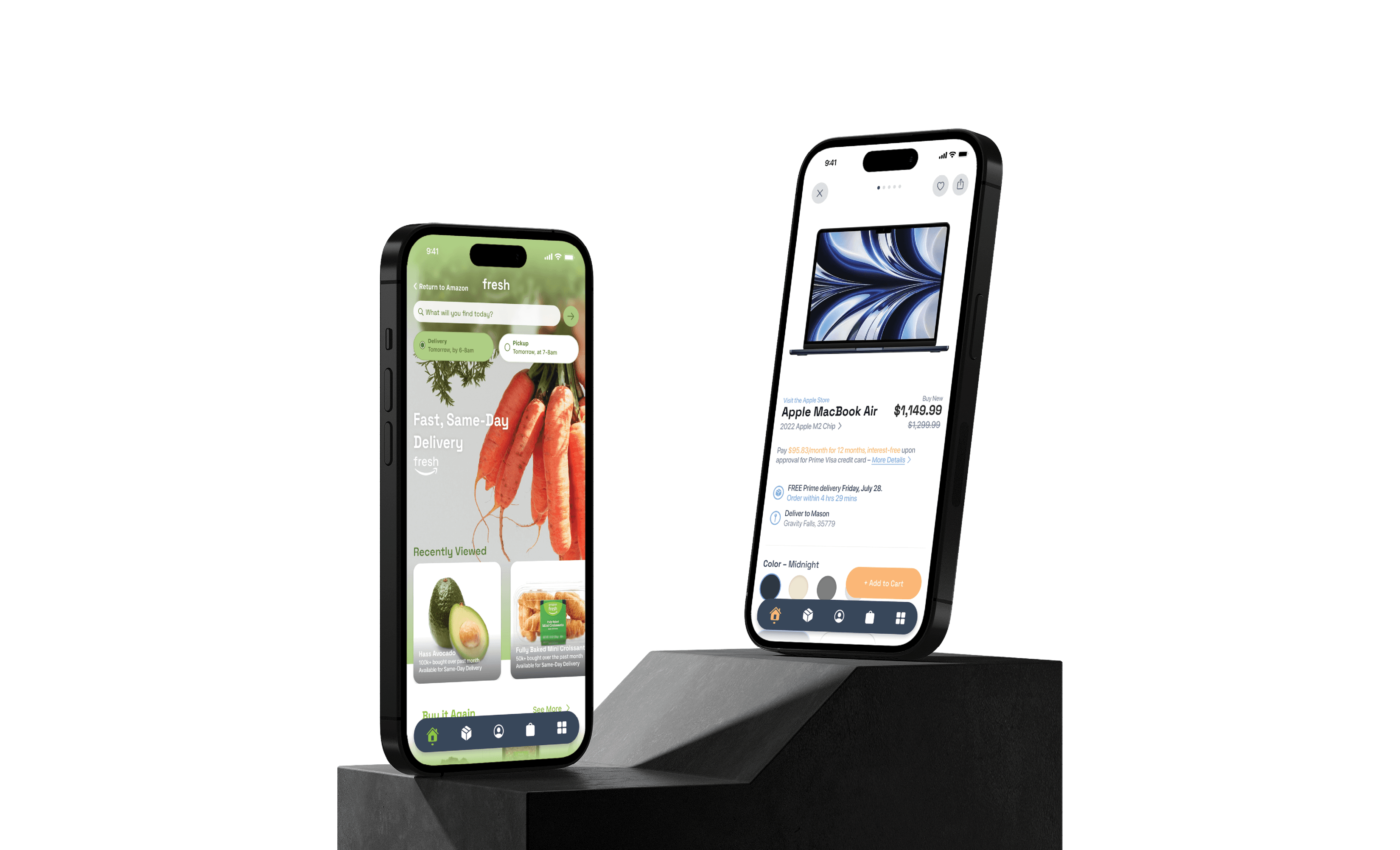
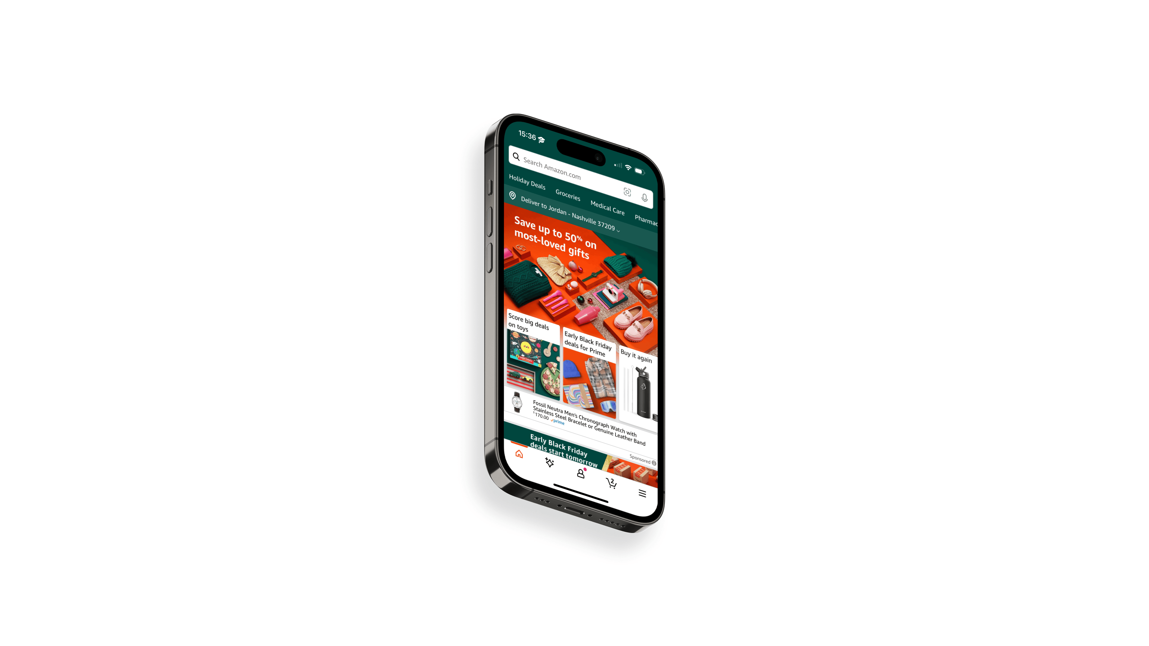
This UX project dives into enhancing the user experience within the Amazon app. We found that the original design often left users confused and frustrated when trying to find much needed items in the app. Our redesign focuses on optimizing the user journey in order to make the app easier and more enjoyable to use.
We believe that by streamlining the user interface and optimizing the user journey, users with busy lives will find what they need faster and with less effort. This will be evident once we see a 35% decrease in overall task completion time and a 20% increase in user visits to the Amazon Fresh section compared to the original baseline data.
The full version of the case study can be viewed on Behance. This project features a full-fledged process book, which goes over every detail of our UX research.


